
Wednesday, 14 February 2018
Tuesday, 13 February 2018

Monday, 12 February 2018
ANCILLARY- DPS Editing Evidence

Using the grid to move the title letters around
 Put in faint lines to place the article |
 Again using the grid to accurately line up my article so it also fits on one side |
Saturday, 10 February 2018
ANCILLARY- DPS Article Copy
Director Katie Price has most definitely
redeemed herself from her most recent train wreck, Surf School, with a new
cinematic piece she created with up and coming editor Samuel Scott. Taking a
new twist on the traditional crime drama, Malefaction gives audiences a
shocking and enticing insight into the story of a serial killer murder. This
unexpected team up of two underrated and talented industry professionals was a
blessing to us all, as their passion for their work is clearly reflected in the
beauty of their film.
The incredibly thrilling short follows the story
of a typical Jane Doe murder, but the way in which the story is portrayed
through the cinematography, sound, editing and mise-en-scene is unseen in
modern British cinema. It almost feels like a sin to give too much away. It begins with a morgue scene, slowly revealing
the story behind the murder. The acting from Luke Howe will send cold shivers
down your spine as you impatiently wait upon the edge of your seat, desperate to
see what happens next. He plays an interesting yet frighteningly mysterious
pathologist, performing a horrifically graphic and realistic autopsy within the
first minute of the film, making you torn between struggling to watch, but also
being unable to peel your eyes away. Although most comments about films are
solely down to a person’s own opinion, it appears undeniable that the choice of Luke Howe
was the perfect casting decision. Not only does he fully become involved with
the character, but his overall look and aura is totally unforgettable.
Despite being a short film with a mere 5 minutes
in which to entice audiences, it includes the excitement and thrill expected of
a crime drama. With blood, weapons and an atmosphere of pure mystery, it does not
fail to tick all of the boxes for fans of the genre. It shows us the murder of
a typical loving and innocent mother by an unsympathetic serial killer, whilst
also giving us an insight into the hustle and bustle of a typical UK crime
scene.
Samuel Scott shows us how experience in the
industry does not necessarily equate to the production of higher quality
cinema. His fresh creative outlook brings a new take on the classic editing of
crime drama short films, effectively creating a dark and troubling atmosphere.
This is also created through Price’s decision to use a blue gel during the morgue scene, cleverly
creating the sense of a cold temperature and tense mood just through a simple
piece of plastic.
In short, this is a ‘cut’ above the rest and should
not be missed.
Thursday, 8 February 2018
ANCILLARY- DPS Photoshoot Reflection
Unlike my poster, with my double page spread I wanted screenshots from my film rather than photos that were taken separately. This is because with double page spreads, their images are either behind the scenes or previews from the movie- screenshots.
When choosing photos for my DPS I knew I wanted the main image to be from the morgue, primarily due to the fact it is our best scene in terms of cinematography and general aesthetic. The blue gel used over the lens also creates the perfect mood for the film- cold and dark, hence why it is also effective as a main image. The mise-en-scene and mood created also connotes the genre very clearly. I didn't want the image to be full or have a character in it as it's used as the background of the DPS.
I took inspiration from a few other double page spreads by the fact they used cartoon film reels to display more images from the film. I took a template of this from the internet and then watched back all of the footage, taking screenshots of some of my favourite shots. In the end I chose these as they ensured all of the characters/actors were shown off on the double page spread, and I also chose the photo of the detective holding the card as it's the serial killer's signature.
Wednesday, 7 February 2018
ANCILLARY- DPS Original Images
 |
| Original main image |
 |
| Film reel template I used |
 |
| Film reel image |
 |
| Film reel image |
 |
| Film reel image |
 |
| Film reel image |
Monday, 5 February 2018
ANCILLARY- DPS Heading & Font Ideas

When creating my poster, I researched what fonts are typically used for crime dramas. I discovered that they were commonly fairly simple yet aggressive looking, and one particular website recommended helvetica. I experimented with a few before deciding helvetica created the almost perfect look I was aiming for. To improve it I made it bold to make it stand out more.
 The blue tint I added to my poster (due to the fact the morgue scene was filmed using a blue gel) meant a black font didn't quite work. I changed it to white and lowered the opacity, creating more of a theme. I absolutely loved this and therefore decided to use it for the colour theme of my DPS. I also used helvetica for every bit of font of the page for the sake of continuity.
In terms of the final layout of my heading, this was decided from general reading of magazines in my spare time. I found it in magazines such as Wavelength. Albeit they weren't film magazines, I decided bring over the idea as they share similar target audiences. The layout of the letters took a surprisingly long time to attempt to place them all correctly using the grid.
Sunday, 4 February 2018
ANCILLARY- DPS TA Primary Research


Screenshots received the most votes and this was unsurprising as on most film reviews, the screenshots will capture the most attention from the audience as they're the most visually appealing and memorable parts of the page. A final verdict and images of the cast came in close second and third, so I will make sure to involve these when creating my film review double page spread. The suggestions in 'others' were all valid, but were actually answers to a slightly different question in the survey later on.

Next I asked my audience what sort of image they would expect to be the primary focus of a double page spread. With this question I genuinely wanted their opinion, mainly to choose between whether or not it'd appeal them more if it was an image of the main character(s) or a screenshot. When doing my research I found that both were used, so decided to use my audience as a method of deciding which was best. They chose a screenshot, leading to my final decision in using my personal favourite shot from our film.


With this question, upon doing my research I came to the conclusion that all of the above answers are relevant and important to include in an article. Acting, cinematography and narrative came out with the most votes, meaning I may put more emphasis on them in my review. In the 'other' response someone answered saying 'All of the above', which I'd decided on after my research anyway.

Lastly I asked them what colours they believed appropriate for a film review double page spread on a crime drama. However, with this I actually think I'll go with a blue colour palette due to the fact I want to create a brand, and the colour blue has consistently been used. A blue filter was used for the most relevant scene in my film, the morgue scene and also my poster, meaning it makes sense to create a sense of continuity by using it on my double page spread too.
Saturday, 3 February 2018
ANCILLARY- DPS Codes & Conventions
With film reviews on double page spreads, there's not a massive variation when comparing reviews on different film genres. They also don't differ too much from a typical double page spread article. The aim of the double page spread is to share the writer's personal opinion of the film, giving the reader an insight as to the narrative and general enjoyability and effectiveness of the cinematic piece. Although it is down to personal opinion, many people rely on reviews to determine whether or not a film is worth investing the time into watching.
All double page spreads will have a stand out title and with film reviews this will obviously be the title of the film, and is usually made bigger than a title of a normal double page spread. This is to make it very easy to see what film is being reviewed upon a quick glance. Typically a similar or the same font is used as the one for the actual film and/or poster for a sense of continuity.
All double page spreads have a main image specifically chosen to attract the attention of the reader. With a film review this image will be a screenshot from the film and can either depict the main character(s) or be the most visually appealing and interesting to look at screenshot from the film. With the former this is used when the star vehicles of the film are big Hollywood names, meaning they're an effective tool for promotional material. Sometimes it can be a mixture of both. With short films it's usually the latter as they don't tend to have big names starring their film.
In terms of secondary images on double page spreads, a slight variation can occur. Some only have one image, some have other screenshots from the film and others will be behind the scenes on the film set. By using other screenshots from the film it gives the magazine the opportunity to show off other characters and scenes in the film, so will use a complete mix of screenshots from the film to make it more interesting and give the audience more of a complete picture of what the film looks like. Behind the scenes images can be very enticing for a reader as it gives them a special insight into the makings of the film. As most film review double page spreads are in film magazines dedicated to reviews they have a very specific audience of people passionate about the industry. I for one know that being able to see behind the scenes is very appealing as I want a career in the film industry.
A lot of double page spreads will also have a specific quote in large text, and this quote will often be a very strong and occasionally controversial opinion or general statement about the topic. With film reviews it will be a strong opinion about one aspect of the film, typically the ability of a cast or crew member behind the film. As it's in big font it's one of the first things likely to catch a reader's eye, meaning it has to be a strong opinion to make the reader interested so as to make them read the article to find out why the writer has that specific opinion. A lot of film reviews I came across, online and in magazines, also came with a direct verdict on the film- a rating. Most used the 5 star rating system. This final verdict is usually in larger text that the article meaning the reader will most likely see it before the reading the article, ensuring that they straight away know the writer's opinion on the film.
The article itself aims to inform the reader of the film narrative whilst also giving readers the writer's opinion of the film. It can be very personal and often contains quite strong opinions as film critics are supposed to be very opinionated when writing about a film. Not only does this make for a more interesting read but a review with no real judgement made destroys the purpose of a review- to give an opinion. It comments on all aspects of the film from the mise-en-scene, to the acting, to the cinematography. This helps create a full picture for the reader.
With all double page spread film reviews the colour palette tends to follow the same theme of the film and other promotional material such as the film poster. With crime dramas this will of course be the expected red and blue to make the link with a police siren.
Other things that are necessary to include in a double page spread include the page number, name of the magazine and date the magazine was printed.
ANCILLARY- DPS Analysis 2

The purpose of a film double page spread in a magazine is commonly to review a film and to give the writer's personal opinion about it. Film magazines can also give an insight into the behind the scenes of a film.
Plain font is used due to the fact fancy font is more typically for a female target audience, and with long pieces of text plain font will be used to ensure that it is as easy as possible for the audience to read. This is essential as no magazine would want to risk putting off their audience by making something difficult to read. Bold font is used to put emphasis on the title so that it stands out on the page, making it easy for anyone curious about the film to find the article. Other important parts of the text in the article, such as quotes, are highlighted by different coloured text boxes or the text is a different colour, making them stand out visibly on the page. Interestingly the quote is from a crew member, rather than from the writer pinpointing an aspect of the film to make a strong opinion about. This, along with the behind the scenes photo shows that this magazine is primarily for an audience really passionate about film, and potentially part of the film industry or just extremely willing to learn more.
The black font against the plain white background makes it very easy for the audience to read, important when attracting an audience as something that's difficult to read will not be appealing to them.
This particular double page spread includes lot of images, making it very visually appealing and interesting to look at. It includes screenshots from the film so as to almost give the readers a taster of what the final product will look like- a sort of sneak preview. This also gives the audience something to visualise when reading the article. However, once again this double page spread supports Malik's theory that other ethnicities besides white aren't represented. The male characters break Gauntlett's 2002 theory that males have to be displayed as alpha males- here they're all hobbits and unexpected looking heroes. This idea is an appealing factor of the film as everyone loves to see an underdog rise to the top.
This double page spread chose to use behind the scenes images. Their target audience will primarily be people who are very interested in films and many will also be interested in the creation of them- how they got from a script to the big screen. This insight may also be exclusive to the magazine, setting it apart from others.
Again the article covers all aspects of the film, but mainly focuses on the story of behind the scenes. This makes the behind the scenes images relevant and is the perfect content for people with a deep interest in the film industry and how it all works.
Friday, 2 February 2018
ANCILLARY- DPS Analysis 1
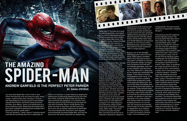
Considering film review double page spreads don't really vary depending on the genre of the film being reviewed, I felt it remained appropriate to analyse a double page spread on The Amazing Spider-Man from Empire magazine. The aim of every film review is to give reader's an insight into the film and to give them the writer's personal opinion on it. For some they rely on reviews to determine whether or not a film is worth seeing in the cinema.
I personally loved the layout of this particular double page spread, particularly the use of the main image essentially being the background of the pages. I felt it really immersed me into the film and helped it come alive, whilst also being a nice visual image for the reader when they're reading the article. It also just generally makes the page more visually appealing and interesting to look at. With this double page spread they didn't choose a screenshot from the film for the main image, but instead a specially shot photo including the main hero, which is obviously appropriate considering the title is the name of the hero. This is more common with bigger Hollywood films due to their significantly larger budgets. As an image it works very effectively as it not only shows off the main character, which helps attract their target audience due to the fact it's a running series of Spiderman films and comics, but the mise-en-scene perfectly connotes to the audience aspects of the narrative and the genre. The costume is iconic in the MARVEL franchise and this, along with the pose, gets it across to audiences not familiar with MARVEL that it's a superhero film. The fact that Spiderman is the only part of the double page spread in colour helps draw attention to his character.
It's rare to see a film review with only one image, and this double page spread is no exception. As well as the main image it contains four screenshots from the actual film- a necessity when reviewing a film. Without anything to visualise it makes it a more difficult read. Each of the screenshots are from completely different scenes so as to have more of a variation, and I like how they all contain different characters. By showing off all the different characters it makes sure that more of the film is covered, as a film review is supposed to cover the entire film rather than just on aspect, scene or character. The use of an image of Emma Stone follows Laura Mulvey's 1975 theory that argues women in the media are used as; "Erotic objects of desire". Although she isn't the main image, her character was chosen to be a side image to attract the male audience. It breaks conventions by having no behind the scenes images but these don't need to be included for a review, they're more so just an added bonus for people very interested in the film industry rather than just the films themselves. However the choice of people for the images supports Sarita Malik's 1998 theory that states "Black and Asian audiences are still not sufficiently catered for". This double page spread shows no variation in race or culture and although this will represent a majority of their target audience it still leaves other ethnicities unrepresented in the media- an issue still prominent today.
The quote chosen focuses on the acting- they can have the flexibility to choose what aspect of the film to comment on. Quotes will always be in bigger text so as to draw more attention, so the writer will pinpoint on part of the film they feel most strongly about. As Empire magazine is a very big and mainstream magazine they have a wider audience than smaller ones such as Sight&Sound meaning their audience is not necessarily just consisting of people really passionate about film. This means that a large amount of people in their target audience will be more interested in the performance of their favourite/large actors/actresses than the success of, for example, the cinematographer. This means a quote on a large actor attracts people to read the article as they're a fan, or just recognise the actor.
The content of the article contains and reviews every aspect of the film from the acting, to the ability of the cinematographer to the sound and mise-en-scene. This is important for audience's to get a full view and opinion on the whole film, rather than just certain parts of it.
Thursday, 1 February 2018


Subscribe to:
Posts (Atom)