Friday 25 November 2016

Initial Film Ideas

Overview of Film Opening

The values that our opening will stand for is the wholesome happy school idea, which is especially necessary due to the fact it's a comedy so can't contain much depressing content. People will be represented through the props used, a majority will be school based props which will represent our target audience of teenagers as most will be in some form of (possibly full time) education. We'll also used some beach/sea themed mise-en-scene to represent people in the local area, which is necessary for an independent film with a niche audience.

Alternative titles

  • Surfing, School and So Much Drama 
  • Brooklyn Ash
  • Madison Academy
  • Mean Teens
Surfing, School and So Much Drama won the most amount of votes in a survey monkey I created, which I ensured was sent only to people in my target audience (more so my primary target audience). Madison Academy got no votes. Surfing, School and So Much Drama uses alliteration which, despite it being a fairly long title, will help it be memorable for the audience because of its rhythm, and lets the audience know straight away what the content of the film will be (without giving too much away), helping attract the target audience.

Fonts

The title for our film will be central on the screen to emphasise its importance and ensure that the audience pay attention to it. After experimenting with fonts, me and my partner agreed to go along with a handwritten appearing font, which we felt was appropriate for a teen movie as it fits in with the school theme (a convention for teen films). Positioning of the graphics in most sequences tends to vary but because my props will be for the sole purpose of being decoration for the names, all of our titles will be central. They will use a simpler font but for most they will be an actual part of the footage rather than edited on in the post production stage. The transitions will stay as simple cuts so as not to draw too much attention away from the titles, and will be designed to be almost unnoticeable by the audience.

Sub-Genre Conventions

Narrative and Representation

  • Cliques
  • Nerd- glasses, really clever, struggles to converse with member of the opposite sex
  • Cheerleader- airhead, slut, gorgeous, popular
  • Jock- bully, popular, vain, dumb
  • Outsider- sarcastic, relatable, sees people for who they really are
  • New girl- different from everyone else, breaks stereotypes, kind, intriguing
  • Mainly set in high school (possibly middle school/college) in America
  • Slight bit of narrative, only with the purpose of connoting characters personalities  and the genre

Media Language

  • (Mid) close up shots
  • Point of view shots
  • Continuity editing (for the sake of making it flow, different types of editing will take attention away from the humour)
  • Mise-en-scene: a school, school equipment, everyday objects (to create a realistic effect and connote aspects about the main character)

Sound and music

  • Upbeat instrumental (to create a happy atmosphere which is essential for a comedy)
  • Diegetic sound effects (for a realistic effect)

Title Order

Zombieland

  • ___ presents
  • In association with __
  • A __ production
  • Actors
  • Title
  • Actors
  • Casting by
  • Costume designer
  • Music by
  • Edited by
  • Production designer
  • Director of photography
  • Executive producers
  • Produced by
  • Written by
  • Directed by

Skyfall

  • Productions presents
  • Main actor, who he plays
  • Title
  • Other actors
  • Co-producers
  • Script supervisor, sound recordist, electrical supervisor, second unit assistant director
  • Make up designer, hair designer, main actor's make up, wardrobe supervisor, publicity and marketing, promotions
  • Supervising art director, set decorator, property master, construction manager, stills photographer, visual effects producer
  • Production supervisor, location production managers, second unit production manager, post production supervisor
  • Visual effects and miniature supervisor, associate producer
  • Unit production managers, first assistant director
  • Casting by, main titles designed by
  • Special effects and miniature effects supervisor, stunt coordinator 
  • Second unit director
  • Costume designer
  • Editors
  • Director of photography
  • Production designer
  • Music by
  • The song name, performed by, written by, produced by
  • Ex producer
  • Written by
  • Produced by
  • Directed by

The Girl with the Dragon Tattoo

  • __ and __ presents
  • A ___ production
  • A ___ film
  • Main actor
  • Title
  • Actors
  • Casting by
  • Costume designer
  • Co-producers
  • Sound design by
  • Music by
  • Editors
  • Productions designer
  • Director of photography
  • Executive producers
  • Produced by
  • Based on the book __, originally published by __
  • Screenplay by
  • Directed by

Back to the Future Part II

  • __ presents
  • A __ film
  • (Shows a bit of narrative)
  • Title
  • Actors
  • Casting by
  • Associate producer
  • Visual effects supervisor
  • Costume designer
  • Music by
  • Edited by
  • Production design by
  • Director of photography
  • Executive producers
  • Screenplay by, story by
  • Produced by
  • Directed by
Every title sequence follows a basic order, but the roles shown depend on the genre of the film. With big action films like Skyfall (part of the well known James Bond series) they require more people to make it action packed and exciting, with sci-fi films the visual effects people need to be recognised and with films based on books they have to recognise the book it's based on in the opening titles. Some title sequences are at the end of the film and tend to be quite different with the director at the beginning rather than the end, although I didn't use any of those examples in this blog post. They all start with the companies involved, followed by the title and then the actors (going from bigger actor or main character to the other end of the spectrum). The titles then show who the casting is done by, then the costume designer (occasionally with a few other roles in between). This is later followed by the co-producers, sound designers/music by, editors, director of photography, producers, the book it's based on if it's based on one, the writer, the producer and then the director is last.

Friday 18 November 2016

Genre Specific Analysis

Submarine


A lot of narrative is used for this title sequence, giving the audience an insight into the main character. In terms of youth theories, he supports part of Stanley Hall's theory (1904) that "the common mood of teenagers is a state of depression." This is shown through the dark lighting and colour palette's used. He appears to disrupt the other parts of his theory that argues "young people are extreme and need excitement", and doesn't seem to follow the idea that youth are mixed metaphors "fun" and "trouble maker". This character in particular doesn't appear to follow either.
Theorist Andrew Higson (1998) writes, "Identity is generally understood to be the shared identity of naturalised inhabitants of a particular political-geographic space- this can be a particular nation or region." Even during just the title sequence multiple establishing shots are used to relate to people who live in that particular are or areas that look similar.
As I want my film to have a more uplifting atmosphere I'll more so use the other theories surrounding youth. 

When it comes to race and sexuality, teen comedies don't tend to vary their cast. White Caucasians are, a majority of the time, used for the main character. This supports Sarita Malik's argument (1998) that "Many feel that Black and Asian audiences are still not sufficiently catered for and that insensitivity towards issues of race and ethnicity still exist. The reality of a lived multiculturalism is not represented in the British media.” She also argues that "Whiteness has been naturalised" which is proven by the lack of variety in race in many films, especially in teen comedy genre. Gay characters either have the story revolve around their sexuality if they're the main character, or they're used as a sidekick. It's more common to see gay males used for a comical effect, support Andy Medhurt's theory about sexuality. His theory states that "Films and television comedies are full of images of gay men as effeminate screaming queens... It chooses that aspect of gay male behaviour (SELECTION), inflates it into the defining male characteristic of male homosexuality (MAGNIFICATION), then establish it as the most easily recognisable image (REDUCTION)." He argues further that this is done to make heterosexual viewers feel safe in the belief that their way of life is the only 'natural one'- making them feel superior.  
Teen comedies usually have an age rating of 12/12A meaning that their content has to be age appropriate, but the female characters still tend to support Laura Mulvey's theory (1975)that women are treated “As erotic objects of desire for the characters within the story, and as erotic objects of desire for the spectator." Despite a lack of nudity in teen comedies, attractive females are still selected for the main parts (or as a love interest). Class isn't a major area that's prejudiced against in teen comedies, although occasionally it can be used as the basis of a narrative that revolves around a bullied character. This supports Andy Medhurst's theory (1998) that states; "They are awful because they are not like us." (the "us" being middle class, white males). Characters who evidently fit into a social class of C2 or lower tend to be portrayed as bullied or a bully, creating a stereotype for teenagers in low income families.

Friday 11 November 2016

Target Audience


When films are attempting to identify their target audience they begin by brainstorming around five ideal movie fan categories that their movie could appeal to. Their next vital step is to understand and get to know their audience, this is important so that they know what needs to be included in their films/advertisements for films that will actually attract the correct group of people. They have to think of a few questions, such as; Who are these people? Are they primarily men? Women? Teenagers? Do they have jobs? Are they business owners or unemployed? What is the average income? Are they college educated? Do they live in the city or on the farm?From this information, they can create audience profiles for five ideal types of movie fans that you want to target, and eventually work up to deciding their primary target audience that, especially with a lower budget, will have to be quite specific. They then have to focus on figuring out why that group of people should watch their movie figuring out why these people enjoy your genre. They have to consider another load of questions like; Why would they want to watch your movie? What makes your movie unique from the other, competing movies in existence? How will your movie to appeal to viewing needs of your audience?


Napoleon Dynamite

Napoleon Dynamite has the same sub genre as the film my group and I intend on making. Their primary target audience are 12-17 males. A lot of teen films would be targeted at slightly older than 12 but Napoleon Dynamite was made a PG, opening up the possibility of their secondary target audience containing younger children. Due to the lack of black characters, and the fact that the main character is white American, their movie would be targeted more so towards white Caucasians in America (secondarily to other countries). As it's a fairly low budget film, the target audience would fit into C2-E on the social grade scale.
Psychographic wise, using Young and Rubican's ideas, they would fall into the category of aspirers. These are materialistic, acquisitive people, who are driven by others' perception of them rather than their own values. Their core need in life is status. A common convention of teen comedies is a nerd desperate to become cool, meaning that predominantly their films will be targeted to people in this category. The lifestyle categories they'd fit into are groupies (wanting to be accepted) and trendies (desperate for admiration from peer group). This is because they will more likely relate to the main character, as the main character is usually a similar image to the primary target audience of the film (or an image of whom they wish to be). Their values would place them into the contented conformers social value group- they want to be 'normal' so follow the herd. Nerds are typically in this category, making the main character once again relate to the target audience.


Mean Girls

Mean girls is quite a different teen comedy to Napoleon Dynamite- rather than the narrative revolving around a nerd, it tells another typical high school story, but of mean girls. Their primary target audience is 13-18 females. Their secondary target audience would be slightly older males or females, and possibly younger girls although it is a PG-13 so would require parental guidance. Once again it's an American film so is targeted towards people living in that area that are white Caucasian due to the incredible lack of black characters (despite being in an America high school of which are usually quite mixed in racial terms). Mean Girls had a much higher budget than Napoleon Dynamite ($17million vs. $400,000), meaning their target audience could have a higher range of social classes, from C1-E. Using Young & Rubican's psychographic groups, their target audience would be classified under reformers, as the film's narrative revolves around a girl eventually stops caring about being popular. Reformers will relate to the resolution of the film, who's core need in life is enlightenment. Just like Napoleon Dynamite, the lifestyle categories their target audience would fall into are groupies and trendies. Despite the main character finding enlightenment at the end, most of the film involves her attempting to fit and receive acceptance and admiration from her peers- making her character relate to people in these groups. Values wise their target audience would be in the strivers category- they attach importance to image and status. By attracting this particular audience, it also helps emphasise the films moral about being yourself.

I learnt that teen comedies are, obviously, targeted towards the same age group, but when targeted towards different genders their layout is completely different (a main difference in the colour palette surprisingly). Social class wise, teen comedies don't aim for extremely high income families, and are targeted usually towards people with the psychographics of wanting to be accepted
.


Survey Monkey

I ensured that my questionnaire was taken primarily by my target audience- teenage females. When sending them the questionnaire I gave them the basic idea of our film. Most go to the cinema quite often, with none of them only watching films at home. Surfing, school and so much drama won a majority of votes as the most appropriate title for our film, and upbeat instrumental won by a landslide for the music expected in the title sequence. The narrative with the most votes is a teenager overcoming bullies, which is very useful as because the survey was given to our target audience we now know what narrative they would find most interesting. For the last question, the audience ad the option to select as many options as they wished. Pink/purple won the majority, with white also being a popular choice. When making our film we will definitely take these answers into consideration, as the people who answered are the people who our film is targeted towards and we need it to be effective.


My target audience

My primary target audience will be females aged between 13-18. Secondarily it could be targeted towards males, or females slight younger/older. As it's filmed in Cornwall, we'll be targeting it towards Cornish white Caucasians (as around 95% of Cornish people fit into this racial group, it's much more effective to have it primarily targeted towards them). Their social grade would be C2-E, mainly because once again Cornish people are primarily quite similar and don't make much income. Also our primary target audience will be students, which is the same for every teen comedy.
Using Young & Rubican's psychographic groups, my target audience would fall into the aspirers category- their core need in life is for status. This will relate them to the main character, as the narrative will revolve around her attempting desperately to fit in. The lifestyle categories they would be a part of are the exact same as the two films audience profiles I analysed- groupies and trendies, with a want to be accepted by those around them and are desperate for admiration from their peers. The value group they would come in to are strivers, which is the same as Mean Girls due to the fact our film has a similar narrative. Their value group, along with the lifestyle category they're a part of will relate to the main character.

Thursday 3 November 2016

Institutional Research

Who produces films?

Image result for marvel studios
    Image result for Paramount Logo 2016
  • Marvel Studios- Marvel Studios has the money to make massive superhero films that would cost a large amount in production costs due to the amount of special effects, extras, costumes and professional actors required. Their primary source of funding is money from the comic books (which would've kick started them off) and eventually previous films, all of which are extremely popular and pull in huge profits. They're top grossing film is The Avengers, with a box office of $1.52 billion. Others high up on their list include Iron Man 3 ($1.215 billion), Captain America: Civil War ($1.153 billion), Spider-Man ($821.7 million) and Deadpool ($782.6 million).
  • Paramount Pictures- this is a very old production company (founded in 1912), and their primary source of funding is? They're best known for the Titanic, which had an incredible box office of around $2.2 billion. It's still a classic today watched worldwide, which means it continues to bring in cash for the company. Some of their other high grossing films include; Transformers: Dark of the Moon ($1.1 billion), Shrek the Third ($799 million), Indiana Jones and the Kingdom of the Crystal Skull ($787 million) and Madagascar 3: Europe's Most Wanted ($747 million).
  • Image Ten- a small independent company that relies on investments from the people creating the films. They're best known for Night of the Living Dead, that grossed around  

Differences between major and independent

  • Independent film companies are usually funded out the directors and/or producers pockets, whilst major film companies can get funding from private investors, film production studios, presales, product placements or a combination, meaning they have a much higher budget.
  • Production teams working on a major film have access to more remote locations. They also stand the advantage of being able to hire professionals who specialise in creating rain, elaborate set designs, combat, explosions or any other ideal element that helps to increase a film's entertainment value. Independent films struggle financially and could go bankrupt attempting to afford to same equipment. They tend to rely on donations, simplistic locations and stunts. This seriously separates the quality of each type.
  • Major production companies will be widely recognised for a lot of films, whereas independent production companies will be less known and would be responsible for less films (feature films)
  • Films made by major companies can be widely distributed whilst films made by independent companies rely more so on film festivals

Distribution companies

Film distribution companies are responsible for the marketing and advertisement of a film. Whereas a film company has a specific producer, its distribution company will usually be different. 

A film distributor is responsible for the marketing of a film. They work alongside production companies by having strong input into when a film is distributed to the public. They may set specific release dates as to when the film is exhibited or made able to be viewed by the public. They do this mainly either theatrically or for home viewing. 

One example of a distribution company is 'The Walter Reade Organisation', who was the distribution company for the film 'Night Of The Living Dead'.
.Image result for the walter reade organizationImage result for night of the living dead


My film will be a teen comedy, something light hearted and relatable for target audience. Production companies that are well known for this genre include Nickelodeon Productions (produced Angus, Thongs, and Perfect Snogging), Offspring Entertainment (produced 17 again), A&M Films (produced The Breakfast Club) and Walt Disney has even produced quite a few (one example being Confessions of a Teenage Drama Queen).

Photoshoot Planning


Big close up
I think this photo turned out quite successful as the location chosen creates a nice relaxed mood, making it a nice photo to look at. The requirements for a big close up is that her entire face is shown only, as if it's slightly more zoomed in it would classify as an extreme close up and if it was slightly zoomed out it would be a close up. The lighting is natural which nicely coincides with the background, and it's also bright enough to make our the details of her face very clearly. Unfortunately due to the angle I took it from there is a reflection on her glasses making it difficult to see her eyes.


Wide shot of an area
Unfortunately for this shoot I was limited to school property so couldn't capture a particularly attractive shot, but I made sure to take it facing the opposite direction to the sun. I did attempt to take photos in the same direction the sun was in but faced a lot of lighting issues. I feel it was quite successful as the whole shot is in focus with no glares or other issues the sun tends to cause.


 I decided to take a variety of photos of feet in an attempt to shoot them in an interesting way. I experimented with different angles, positions of the feet and their location. The three displayed were the ones I deemed as the most interesting. The first one of the leaves represents a season that most view as one of the most beautiful seasons out there. The white shoes also make a nice contrast against the orange/brown leaves. The lighting is kept natural, and I used a point of view shot as that will relate to the person looking at the photo, making it more interesting.  The photo on the right I decide to use her body language as the aspect that would be interesting and the main focus of the image. Although the background is quite plain the body language is kept interesting yet casual looking. The bottom photo on the left I feel is the most interesting to look at as it shows the feet in action, rather than staying still. Although the location chosen doesn't appear particularly exciting, once again the feet are the main aspect of the image.


The top photo is an example of when a photographer doesn't follow the rule of thirds. Our minds jump to the middle of the photo upon first glance, but this makes us lose interest because there is no other depth or perception. If the sand dunes were moved down and were aligned with the bottom line, then the audience would get a better view of the mountains peeking over the top of the sand dunes, allowing the audience to get a real feel of how big the sand dunes are in comparison to the man and the mountains.
PictureMy second photo, on the other hand, uses the rule of thirds very effectively. It gives the image a nice balance of yellow, blue and white, making it pleasant to look at. The tree is also well placed, as it's kept at the intersection of two lines crossing over making it a stronger focal point- the audience's attention will be brought to that specific spot.


My over the shoulder shot wasn't perfectly framed, as there is too much in the background- the main focus is supposed to be the two people involved in the shot. My depth of focus worked well, with the male being out of focus and the female remaining in focus and she is the centre of attention in this image. Over the shoulder shots do also tend to be more zoomed in so as to show off more detail in the person's face.


When taking an image in front of a window I always struggling with overexposure- the person in the image will appear extremely dark. This can only be used effectively when attempting to create a silhouette image.


Analysis Summary

When analysing title sequences I chose Candyman, Deadpool and Napoleon Dynamite.

Key elements

They all began with their most well known company- whether it was their production company or distribution company. This is because it's a good selling point for their film, as if it's a large company it may be easily recognised, attracting people who recognise them as a company for good films to watch it. If both or neither are very large companies then the production company tends to be shown on screen first. The other companies involved are then displayed following the theme of the title sequence, including the previously mentioned companies that were shown at the beginning.
The general order for titles appears to start off with the actors (from lead role/most famous actors to the other side of the spectrum). The movies I selected don't appear to follow a similar pattern, but that's because they're made during different eras and are different genres. The director appears to come first or last to emphasise their importance. They both do include similar titles though; the writers, casters, producers, directors of photography, people in charge of the music and the main editor. Of course, realistically, a lot more people were responsible for these different departments but the person in charge is the one credited at the beginning of the film due to lack of time. They all appear to include a bit of vague narrative, that helps set the scene and create a personality of a character, but not give away anything of the plot. This is effective for enigmas, which are useful in making the audience more eager to watch your film in order to get answers. Every detail right down to the lighting is focused on constructing the genre, more so than the narrative and characters.

I'm going to use this research to adapt my own film opening to make it appear more professional. I wish to more so follow the theme that Napoleon Dynamite uses as I'm aiming to attract the same primary target audience, so will mainly use my analysis of that title sequence to learn and create an effective opening for my coursework.

Napoleon Dynamite- Analysis


  • Production companies: MTV Films, Napoleon Pictures and Access Films
  • Distribution companies: Fox Searchlight Pictures (North America) and Paramount Pictures (International)
  • Date of release: 17th of January 2004 (Sundance Film Festival) and 11th of June 2004 (US)
  • Age certificate: PG
  • It uses a narrative opening to help the audience straightaway feel like they're a part of the movie, but unlike some narrative openings it only gives a vague insight into the narrative, with subtle connotations of it's content and characters. It's also kept quite simple due to the fact it was produced by an independent company, and they always have to work on a lowed budget. 

Institutional Context

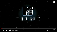
Napoleon Dynamite follows the basic rule of the companies going first. It begins with it's main production company, that has it's own unique construction and scene- MTV Films. Every big company (production or distribution) have their own construction that helps attract a specific audience of people who recognise their previous films (which in a lot of cases can be a selling point for films). It's kept on a simple black background. Their logo begins very close to the camera, zooms in, then zooms out to a readable distance. The MTV part of their logo is especially recognisable as they're known for music. They have to keep the font and construction the same as it's part of a massive company. Just like every big company it's kept in the centre of the screen, as that is more satisfactory for the audience to look at than if it was slightly off centre. The white is used to contrast strongly against the black colour making it extraordinarily easy to see and read. 
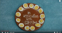
The two distribution companies (plus the production company name shown again)  follow the theme of the title sequence, so don't stand out quite as much which makes them seem less important, which also emphasises the importance of MTV Films. By being at the beginning it is still ensured that the audience will pay attention to them and they'll receive the recognition they deserve. The construction pattern they follow is relevant to show that it's going to be a light hearted film, which straightaway helps create a certain mood just with props. Different colour palettes are used for each shot to make the three companies easy to differentiate. Simple cuts are used between each shot so as not to draw too much attention away from what's happening, but to make the transitions more interesting the titles are moved into the shot, which also makes the audience feel as if they're actually a part of the scene. This is further helped by the fact a point of view shot is used, making it feel more personal. It uses the phrase "in association with" for MTV films as on August 21, 2006, Nickelodeon Movies and MTV Films became full labels of the Paramount Motion Pictures Group.

Narrative

Napoleon Dynamite follows a linear storyline, and not much narrative is involved in the first two minutes. The audience aren't introduced to any characters particularly, although they do get a glimpse at the main character through an ID card that's used to show off the star actor of the film. This ID card also gives an insight to the main character, as people always judge others on their looks when first seeing them. They followed the stereotype of nerdy when creating his character, making it easy to establish one aspect of his personality that will presumably play a large role in the film- his nerdy side, which also suggests he's a loser. Some of the props used like the fake alien ID card, books, handmade ninja star, drawings and even his chapstick support this judgement. Due to the fact that close ups and medium close ups are the only shot types used, the setting is kept vague but because of the props used the audience can easily guess that it's set in a home. The lack of characters, scenery and action works very effectively in creating enigmas for the audience. Whilst the title sequence is kept interesting with a variety of props, it's kept very vague when it comes to telling the audience the beginning of the storyline. This means enigmas are created, and no answers are given. This helps keep their primary target audience interested- teenagers. Stereotypically teenagers are more curious, which means they'll be more eager and intrigued to discover what the movie is about.

Representations

The ID is the most effective piece of mise-en-scene for representing people, as it represents their target audience. Their target audience will consist of people who can relate to their main character. As it's a student ID, it represents teenagers who are currently in education. All of the images used help create the character's personality and represent him before he's even properly introduced. One of the key personality traits of Napoleon, is that he doodles fantasy creatures- and several of the props used involve his drawings. The other props that give an insight into his character, like the pencil case connoting that he is a student, will relate to the primary target audience who will identity with the main character.

Genre

Napoleon Dynamite is part of the comedy genre, and it follows a numerous amount of the conventions associated with this genre. The first title introducing one of the actors is a prime example, as it contains irony and the supernatural. The fact that the character keeps ‘U.F.O abduction insurance’ in his wallet suggests that the film is going to be a spoof of a sci-fi film and conveys that the film is based around a nerdy person. This is a typical convention of comedy films as they tend to show the life of a nerdy character and his friends. Bright lighting is also used in all of the shots, which is a convention of comedy films as it ensures that the audience can capture every comical detail of a shot for more humour. The composure also achieves this. High angle shots are another common convention as they allow the camera to capture the entire shot, and high angle/birds eye view are the only two angles used throughout the sequence. Another convention is the setting to be at a high school, which this movie is and this is shown in one of the first few shots through the main characters student ID, clearly showing he's at school. Comedies can involve a range of characters, but a convention of character type for them to use is a socially awkward nerd. They usually magnify their awkwardness to a comical and unrealistic level for extra effect. The bright and bold colour palette is also a convention, as darker colours would change the atmosphere to be dark and depressing.

Cinematography

Napoleon Dynamite's title sequence is kept fairly in the camera department. No camera movements are used and there is only a slight change in angle and shot type. The angles vary between high angle and birds eye view, whilst the shot types vary between close up and medium close up, but all of them are a point of view shot. By keeping all of the shots fairly similar with everything but content, it's quite satisfying to watch for the audience as it follows a pattern.
By using close up and medium close up shots it ensures that the audience can see the props, which are the main part of the title sequence. It also helps keep the setting a mystery, creating an enigma which is vital to get the audience interested in the movie right at the beginning. Medium close ups are used in some of the shots to fit in more props or bigger props. Close ups are used when there are smaller or less props in the shot. These close-ups are specifically used as they show the audience information about the character; he is nerdy, a teenager at high school and cares for his health. These traits tell us that the film is going to be a comedy because a typical convention of comedy films is that they are based around the life of an ‘unpopular’ teenager. The fact that high angle/birds eye view shots are used allow the audience to focus on what is being placed in the frame and focus on the objects. In the context of Napoleon Dynamite, it's more so because it's a point of a view shot, which makes the title sequence feel very personal to the audience.
The composition in this title sequence is very effective. For most of the shots the titles (and the props they were edited on to) we made central, which is satisfying to look at as it follows a pattern. For some of them, like the pencil shot, they were placed in such a way that it looks like a teenager who just left their school equipment out, so is relatable and quite interesting to look at rather than if it was all symmetrical it could possibly come across as slightly boring.

For some shots where the props were held up rather than lying on the floor, a shallow focus was used to ensure that the depth of field was appropriate for the shot. In the example on the right it was used to focus in on his ID, as if the whole shot was in focus the carpet would take some attention away from the lead actor. For some shots like this the main prop with the name of a person involved with the film comes into focus a few seconds into the shot, which acts as a transition.

Sound

The beginning shot, MTV Films personalised structured logo has it's own sound effects to add a dramatic effect. After that, the non-diegetic title music doesn't begin until the companies have finished displaying and the lead actor's name comes onto screen. Whilst the three companies are coming on and off screen only diegetic sounds are used- ambient background noises (in this case, birds tweeting) and the amplified sound effect of the plates on the table. These sounds are used to make it appear more realistic, which is another aspect that makes the audience feel like they're a part of the movie. This effect can be very successful as it'll make the audience become attached to the storyline and the characters. The birds tweeting will also create a light hearted atmosphere, as that particular sound effect is associated with bright, joyful mornings.. The title music begins roughly 22 seconds into the movie, and further helps create the light hearted atmosphere, as it's a very relaxed and mellow tune. It doesn't fade in either, but begins quite suddenly with the guitar notes. The lyrics are relevant to the story, as they discuss going to school, which will give the audience an insight to the plot. The fact that there's a link between the lyrics and the film means that it creates the perfect mood and atmosphere, and attracts the right target audience of teenagers as they'll possibly relate to the lyrics, and therefore relate to the film. Throughout the title sequence diegetic sound effects are occasionally used when the props are moved around the shot, which reminds the audience that it's a comedy film replicating real life situations. This will also help attract the correct target audience as there are different types of comedies and different people will enjoy different types.

Editing

As it's not a stylised opening, not much variation occurs with the editing. Only simple cuts are involved, as the props being moved into the shot acts as a transition. This is quite different from most films which will make it more interesting for the audience to watch. It allows the music and the video to create a smooth and easy to watch title sequence which matches the genre. The editing is slow, with quite long shots, to match the calm pace of the music. The only variation in editing it involves is at the very end when it fades to black and the music cuts out. This is to clearly signify the end of the title sequence and the beginning of the film.

Mise-en-scene

The set design in this title sequence is it's selling point. Rather than focusing on fancy camera shots and editing, is uses props to relate and represent its audience. All of the props are the only form of narrative that the audience receive, so they had to be very carefully picked so as to give an accurate insight into the character that they created. There's a mixture of food, books and school equipment (to further suggest that he's a nerdy character), drawings (not very good, but to show that he's imaginative and creative), and it even shows you his ID. The background is kept very vague and only consists of a range of carpets/floors, but gives the general idea that it's his home, which sets the scene.
The lighting is kept very natural looking to make it seem even more realistic, but is kept very bright as bright lighting is a convention of the comedy genre. This is because bright lighting generally sets a happier and lighter mood, which is the overall tone a comedy movie goes for. The chosen lighting also enables the audience to see every prop in detail, making it easier to guess the personality of the character and makes it easier to read the names of a lot of the people involved.
The aspect ratio of the shots go along with point of view shots. As humans we have peripheral vision, so by making the shot quite wide it's a more accurate representation of how we see the world.

Titles and credits

After the company names are shown on screen, the music begins and all the people with the most important roles are displayed in this order; main actor and then the character he plays (which strongly emphasises his importance in the plot), more actors (all on food apart from one on a fake ninja star), the person who did the casting and the person who did the music (both written on notes), the editor, the production designer, the director of photography and the executive producer (both written on drawings), the producers (all sharing a shot) and the writers (who both share a shot too). Last to be displayed is the director, before the screen fades to black. They're all constructed in a way that follows the chosen theme of the title sequence- real life. This theme further so lets the audience know that it's a comedy based on real life, which is important to people when choosing what kind of comedy to watch as there are quite a few subgenres of it. Their shots all last for roughly 5 seconds, but this can vary if their shot takes a while to set up. By keeping the timings similar it helps keep the sequence smooth by following a pattern.

Candyman- Analysis

  • Production companies: Propaganda Films and Candyman Films
  • Distribution companies: TriStar Pictures and Polygram Filmed Entertainment
  • Release dates: Sept 11th 1992 (Toronto International Film Festival), Oct 16th 1992 (US) and March 19th 1993 (UK)
  • Age certificate: 18
  • It uses a narrative opening which is a common convention of horror films as many aspects (specifically in this film the music and camera angle) can easily build suspense and connote the genre.

Institutional context


The film starts with the two distribution companies and then the production company. They all fade in which follows genre conventions, especially for the decade this movie was created in where fades were used to slow down the beginning of the film and therefore create a tense atmosphere. Each of the companies texts are constructed in exactly the same simplistic way so as not to draw attention away from the music, which is essential to creating the mood for this film. Keeping it simple in this scenario has been effective mainly due to the genre. The black background, as well as creating a contrast for the white text to be read clearly, is a good colour palette to use as it connotes darkness which is a common fear (suggesting it's a horror), and not to mention that in a cinema it would cause the whole room to be practically pitch black. This would make the audience feel uncomfortable, further building suspense. They're all positioned in the centre of the screen, which is a common convention of all title sequences as it implies the importance of the companies.

Narrative

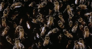
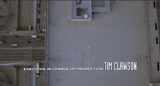
Candyman uses a narrative opening, which involves the credits displaying above a long take tracking birds eye view shot is used, following a road. Although this doesn't establish any main characters and only vaguely establishes any kind of setting, it succeeds in creating a few enigmas that are vital to keeping the audience interested whilst the opening credits are shown- what is the relevance of the road? Where does that road lead to? Are they being followed? That last enigma is created by the angle used, giving the feeling that we're watching from the POV of a bird, stalking it's prey. This helps build suspense, as it will give the audience an uneasy feeling. Candyman is a linear narrative that is kept in chronological order, although in the first two minutes this is not made clear as only one shot is used. The other shot that begins at around 1:49 creates more enigmas as it is a shot of bees (just like in the poster)- why are bees used? What is their relevance? At 1:49 the music ends and a non-diegetic voice, a narrator, speaks over this peculiar shot. It doesn't necessarily establish a character as all you get to hear is his voice, but are left with many other questions about his identity. He discusses shedding blood which builds on the narrative, but also develops the audience's curiosity.

Representations

The first shot is made clear to be a part of a city, which represents the sort of people who go to cities often or live in them (upper class 25+ males and females in particular). The characters in the film are the best way to represent groups in films, but the only character introduced within the first two minutes only has the potential to represent males, but he doesn't because of the sound effects added to his voice making it feel supernatural.

Genre

Candyman main's genre is obvious- horror. The non-diegetic music at the beginning, the colour palette of the first few shots displaying the companies involved and the simplistic opening credits are all genre conventions for a horror. The voiceover towards the end is edited to include echo like sound effects which creates suspense- this is a necessity for horror. The voiceover also connotes the subgenre- supernatural horror. The sound effects layered on top of the narrator give it an eerie, ghostly feel, making the audience suspect that the movie will involve something unnatural and unhuman.

Cinematography

The first two minutes of the film only consists of two different shots. The first shot is the birds eye view tracking shot (achieved with a helicopter) used for the narrative title sequence, and the second shot is a zoom in of bees. The first shot is a long take, meaning that there are no cuts or edits, just the same shot going on for over a minute with no edits. It's also an establishing shot which helps set the scene for the movie. It uses static composition, and in theory they're meant to be somewhat soothing, calming and tranquil. The fact it's not perfectly symmetrical, and the music will make the audience feel uncomfortable and unsettled. This is effective as in horror films, in order for them to suit the genre and be memorable, they have to create this effect. This shot doesn't haven't anything in particular to look at and focus on besides the road, which was placed central of the shot to draw attention that particular road rather than the other ones leading to it.  
This shot zooms in, but the Director of Photography wouldn't have had to spend too much time trying to figure out it's composition and framing as the entire shot is taken up by bees. This would've been on purpose, as there is absolutely nothing else placed in shot to distract attention from the bees, emphasising their importance in the story. This will create a strong enigma for the audience- what is the relevance of bees in the film? It's not an obvious answer, so helps attract and interest the audience as they'll have to continue watching the movie in order to find out their answer. This is the effect that the beginning of a movie should have.


Sound

The non-diegetic title music begins after the companies have been displayed on screen, when the long take of the road comes up along with the other title credits. No ambient sounds or any other diegetic sounds are used, as they would  disrupt the tense atmosphere the music creates. There's no dialogue throughout the whole first two minutes which helps maintain the sense of mystery and uneasiness created by the simplicity of the opening. Only two sounds are used at this point- the non-diegetic voiceover and the diegetic sound effect of the bees, which is made significantly quieter than the voiceover so as not to draw attention away from what the male character is saying. However, the sound effects of the bees buzzing have been amplified to louder than how they'd sound in real life, to add even more uneasiness to the audience. The male's voice has been enhanced and edited to sound more intimidating and aggressive, connoting the genre and giving the audience an insight into the character's personality just from his tone and pace of voice.

Editing

There isn't a large variety of editing  in this particular film opening as it only includes two different shots. There are no characters or actions (other than cars driving in a straight line), meaning it doesn't require any of the rules of continuity editing. For the company names at the very beginning fades are used (only lasting approx. 1 second) to slow down the titles to build up the atmosphere and create the illusion that an old fashioned camera has been used. They would do this to help set the scene, connoting the time period in which the movie is taking part in. These only last 8 seconds, whilst the first shot (the long take with all the other credits on it) takes around 1 minute 40 seconds. Between the long take and the zoom in of the bees is a straight cut, designed to not bring too much attention to itself so that the audience are able to focus more so on the storyline.

Mise-en-scene

The contents and props required for the two shots involved in the first two minutes of the film are kept simple. This could be because the movie was released over 20 years ago, but it's also effective as too much is unnecessary- it could ruin the atmosphere by distracting the audience from the aspects in the shot that are vital towards setting the right mood. The shots are kept vague, so don't give much away in terms of character and narrative.
The first shot, the tracking one following the road, helps set the scene. It's an establishing shot which is a convention of a majority of movies to set the scene right at the beginning of the film. It lets the audience know where the story is taking place. It's not a very specific establishing shot, as most modern movies either skip the shot or show a clip of a easily recognisable famous landmark to let the audience know the exact location. A few movies recently use subtitles to let the audience know where the scene is taking place. The scene is also brightly lit which isn't a convention of horror movies as they tend to use darker lighting, as darkness is a very common fear and has set connotations of bad things. As it is only the beginning of the movie, it could be used to make a bigger contrast between the beginning where everything's ok, and the end where the lighting would be made darker.
The second shot only raises more questions. The sound, the non-diegetic narrator speaking over the shot, is more vital towards constructing the characters, genre and narrative. The shot only lets the audience know one aspect the film will include- bees. With some people this could help connote the genre due to a fear of them (apiphobia). Due to the fact a character is speaking over the top of it, helps us get an insight into the character as it creates a mysterious relationship between that particular character and bees. This shot uses a darker lighting, which works very effectively as the narrator of this particular shot plays the antagonist of the film, which helps construct his character as evil due to the connotations associated with darkness.

Titles and credits

After the companies associated with the film are displayed and the long take of the road begins, the first job title displayed is who directed the film. After that is the title of the film. All of the people's names and job titles are constructed in the exact same way- plain white text of a slightly smaller than medium size. The only difference is the positioning of them on the screen. They all enter the shot through an animated movement, and are displayed in different areas of the shot to make the opening credits appealing and interesting, rather than keeping them all the same as that would appear boring and repetitive. The job titles included are (in order they appeared): actors, executive producer, executive in charge of production, person who chose the cast, sound designer, special make up effects artist, costume designer, film editor, production designer, director of photography, musician, producer, and the writer. No other text appears on screen, although a few of the job titles and names are shown at the same time. The job titles are in smaller text to the names, so as not to draw attention away from the main people responsible for the film.

The title follows the same colour palette- white. The font used is fairly similar to the job titles, but has harsher and more pointed edges to connote that this character, the "Candyman" is harsh and possibly violent. The text for the title also takes up a large portion of the screen to ensure that it has the audience's attention, and it also has to separate itself from the the other credits as it's the most important.