- Production companies: MTV Films, Napoleon Pictures and Access Films
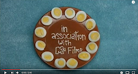
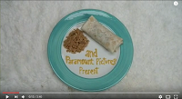
- Distribution companies: Fox Searchlight Pictures (North America) and Paramount Pictures (International)
- Date of release: 17th of January 2004 (Sundance Film Festival) and 11th of June 2004 (US)
- Age certificate: PG
- It uses a narrative opening to help the audience straightaway feel like they're a part of the movie, but unlike some narrative openings it only gives a vague insight into the narrative, with subtle connotations of it's content and characters. It's also kept quite simple due to the fact it was produced by an independent company, and they always have to work on a lowed budget.
Institutional Context
 Napoleon Dynamite follows the basic rule of the companies going first. It begins with it's main production company, that has it's own unique construction and scene- MTV Films. Every big company (production or distribution) have their own construction that helps attract a specific audience of people who recognise their previous films (which in a lot of cases can be a selling point for films). It's kept on a simple black background. Their logo begins very close to the camera, zooms in, then zooms out to a readable distance. The MTV part of their logo is especially recognisable as they're known for music. They have to keep the font and construction the same as it's part of a massive company. Just like every big company it's kept in the centre of the screen, as that is more satisfactory for the audience to look at than if it was slightly off centre. The white is used to contrast strongly against the black colour making it extraordinarily easy to see and read.
 The two distribution companies (plus the production company name shown again) follow the theme of the title sequence, so don't stand out quite as much which makes them seem less important, which also emphasises the importance of MTV Films. By being at the beginning it is still ensured that the audience will pay attention to them and they'll receive the recognition they deserve. The construction pattern they follow is relevant to show that it's going to be a light hearted film, which straightaway helps create a certain mood just with props. Different colour palettes are used for each shot to make the three companies easy to differentiate. Simple cuts are used between each shot so as not to draw too much attention away from what's happening, but to make the transitions more interesting the titles are moved into the shot, which also makes the audience feel as if they're actually a part of the scene. This is further helped by the fact a point of view shot is used, making it feel more personal. It uses the phrase "in association with" for MTV films as on August 21, 2006, Nickelodeon Movies and MTV Films became full labels of the Paramount Motion Pictures Group.
 Narrative
Napoleon Dynamite follows a linear storyline, and not much narrative is involved in the first two minutes. The audience aren't introduced to any characters particularly, although they do get a glimpse at the main character through an ID card that's used to show off the star actor of the film. This ID card also gives an insight to the main character, as people always judge others on their looks when first seeing them. They followed the stereotype of nerdy when creating his character, making it easy to establish one aspect of his personality that will presumably play a large role in the film- his nerdy side, which also suggests he's a loser. Some of the props used like the fake alien ID card, books, handmade ninja star, drawings and even his chapstick support this judgement. Due to the fact that close ups and medium close ups are the only shot types used, the setting is kept vague but because of the props used the audience can easily guess that it's set in a home. The lack of characters, scenery and action works very effectively in creating enigmas for the audience. Whilst the title sequence is kept interesting with a variety of props, it's kept very vague when it comes to telling the audience the beginning of the storyline. This means enigmas are created, and no answers are given. This helps keep their primary target audience interested- teenagers. Stereotypically teenagers are more curious, which means they'll be more eager and intrigued to discover what the movie is about.Representations
The ID is the most effective piece of mise-en-scene for representing people, as it represents their target audience. Their target audience will consist of people who can relate to their main character. As it's a student ID, it represents teenagers who are currently in education. All of the images used help create the character's personality and represent him before he's even properly introduced. One of the key personality traits of Napoleon, is that he doodles fantasy creatures- and several of the props used involve his drawings. The other props that give an insight into his character, like the pencil case connoting that he is a student, will relate to the primary target audience who will identity with the main character.Genre
Napoleon Dynamite is part of the comedy genre, and it follows a numerous amount of the conventions associated with this genre. The first title introducing one of the actors is a prime example, as it contains irony and the supernatural. The fact that the character keeps ‘U.F.O abduction insurance’ in his wallet suggests that the film is going to be a spoof of a sci-fi film and conveys that the film is based around a nerdy person. This is a typical convention of comedy films as they tend to show the life of a nerdy character and his friends. Bright lighting is also used in all of the shots, which is a convention of comedy films as it ensures that the audience can capture every comical detail of a shot for more humour. The composure also achieves this. High angle shots are another common convention as they allow the camera to capture the entire shot, and high angle/birds eye view are the only two angles used throughout the sequence. Another convention is the setting to be at a high school, which this movie is and this is shown in one of the first few shots through the main characters student ID, clearly showing he's at school. Comedies can involve a range of characters, but a convention of character type for them to use is a socially awkward nerd. They usually magnify their awkwardness to a comical and unrealistic level for extra effect. The bright and bold colour palette is also a convention, as darker colours would change the atmosphere to be dark and depressing.Cinematography
Napoleon Dynamite's title sequence is kept fairly in the camera department. No camera movements are used and there is only a slight change in angle and shot type. The angles vary between high angle and birds eye view, whilst the shot types vary between close up and medium close up, but all of them are a point of view shot. By keeping all of the shots fairly similar with everything but content, it's quite satisfying to watch for the audience as it follows a pattern.By using close up and medium close up shots it ensures that the audience can see the props, which are the main part of the title sequence. It also helps keep the setting a mystery, creating an enigma which is vital to get the audience interested in the movie right at the beginning. Medium close ups are used in some of the shots to fit in more props or bigger props. Close ups are used when there are smaller or less props in the shot. These close-ups are specifically used as they show the audience information about the character; he is nerdy, a teenager at high school and cares for his health. These traits tell us that the film is going to be a comedy because a typical convention of comedy films is that they are based around the life of an ‘unpopular’ teenager. The fact that high angle/birds eye view shots are used allow the audience to focus on what is being placed in the frame and focus on the objects. In the context of Napoleon Dynamite, it's more so because it's a point of a view shot, which makes the title sequence feel very personal to the audience.
 The composition in this title sequence is very effective. For most of the shots the titles (and the props they were edited on to) we made central, which is satisfying to look at as it follows a pattern. For some of them, like the pencil shot, they were placed in such a way that it looks like a teenager who just left their school equipment out, so is relatable and quite interesting to look at rather than if it was all symmetrical it could possibly come across as slightly boring.
 For some shots where the props were held up rather than lying on the floor, a shallow focus was used to ensure that the depth of field was appropriate for the shot. In the example on the right it was used to focus in on his ID, as if the whole shot was in focus the carpet would take some attention away from the lead actor. For some shots like this the main prop with the name of a person involved with the film comes into focus a few seconds into the shot, which acts as a transition.
Sound
The beginning shot, MTV Films personalised structured logo has it's own sound effects to add a dramatic effect. After that, the non-diegetic title music doesn't begin until the companies have finished displaying and the lead actor's name comes onto screen. Whilst the three companies are coming on and off screen only diegetic sounds are used- ambient background noises (in this case, birds tweeting) and the amplified sound effect of the plates on the table. These sounds are used to make it appear more realistic, which is another aspect that makes the audience feel like they're a part of the movie. This effect can be very successful as it'll make the audience become attached to the storyline and the characters. The birds tweeting will also create a light hearted atmosphere, as that particular sound effect is associated with bright, joyful mornings.. The title music begins roughly 22 seconds into the movie, and further helps create the light hearted atmosphere, as it's a very relaxed and mellow tune. It doesn't fade in either, but begins quite suddenly with the guitar notes. The lyrics are relevant to the story, as they discuss going to school, which will give the audience an insight to the plot. The fact that there's a link between the lyrics and the film means that it creates the perfect mood and atmosphere, and attracts the right target audience of teenagers as they'll possibly relate to the lyrics, and therefore relate to the film. Throughout the title sequence diegetic sound effects are occasionally used when the props are moved around the shot, which reminds the audience that it's a comedy film replicating real life situations. This will also help attract the correct target audience as there are different types of comedies and different people will enjoy different types.Editing
As it's not a stylised opening, not much variation occurs with the editing. Only simple cuts are involved, as the props being moved into the shot acts as a transition. This is quite different from most films which will make it more interesting for the audience to watch. It allows the music and the video to create a smooth and easy to watch title sequence which matches the genre. The editing is slow, with quite long shots, to match the calm pace of the music. The only variation in editing it involves is at the very end when it fades to black and the music cuts out. This is to clearly signify the end of the title sequence and the beginning of the film.Mise-en-scene
The set design in this title sequence is it's selling point. Rather than focusing on fancy camera shots and editing, is uses props to relate and represent its audience. All of the props are the only form of narrative that the audience receive, so they had to be very carefully picked so as to give an accurate insight into the character that they created. There's a mixture of food, books and school equipment (to further suggest that he's a nerdy character), drawings (not very good, but to show that he's imaginative and creative), and it even shows you his ID. The background is kept very vague and only consists of a range of carpets/floors, but gives the general idea that it's his home, which sets the scene.The lighting is kept very natural looking to make it seem even more realistic, but is kept very bright as bright lighting is a convention of the comedy genre. This is because bright lighting generally sets a happier and lighter mood, which is the overall tone a comedy movie goes for. The chosen lighting also enables the audience to see every prop in detail, making it easier to guess the personality of the character and makes it easier to read the names of a lot of the people involved.
The aspect ratio of the shots go along with point of view shots. As humans we have peripheral vision, so by making the shot quite wide it's a more accurate representation of how we see the world.


Fantastic Katie - detailed and thorough research with accurate terminology.
ReplyDeleteLook at representations more - the titles still show us something about the character.
Sort of...think about how the types of images used help show what the main character is like.
ReplyDeleteBetter. Thank you
ReplyDelete