The morgue scene was definitely the most impressive in terms of cinematography and mise-en-scene, hence why I chose it for my poster image. Sam and I both ensured we used the cameras to take photos as just relying on the footage to take screenshots of is risky. Before the shoot I planned a couple of potential images I wanted, varying from pictures of the victim, pathologist and mise-en-scene.
Luckily we had plenty of time during the shoot in which to take photos, and I was personally very happy with the results. I swapped between using the natural light and our artificial lights, experimenting to see which looked best. In the end I went for the artificial lighting as when placed in a specific place it can create shadows. Initially I planned for my poster to contain the victim and the pathologist/serial killer, but upon reviewing the images of Luke I decided they would look better alone. The shadows created made him look like a dark and mysterious character, and the heart in his hands not only connoted the genre and made the poster interesting therefore attracting our primary target audience, but it also links with the fact his serial killer name is the Knave of Hearts.
Wednesday, 31 January 2018
Tuesday, 30 January 2018
Monday, 29 January 2018
ANCILLARY- Poster TA Primary Research
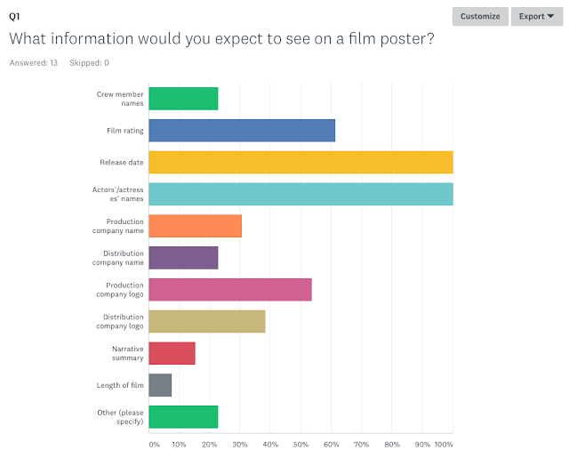

My first question I asked them on the poster survey was what information they would expect to see on a film poster. However my target audience answered this with a mainstream cinema large film in mind, whereas I'm making a poster for an independent small film. Upon my research I discovered there were noticeable differences in what information they displayed, as larger film contained a lot more, such as those voted for in the above screenshot.
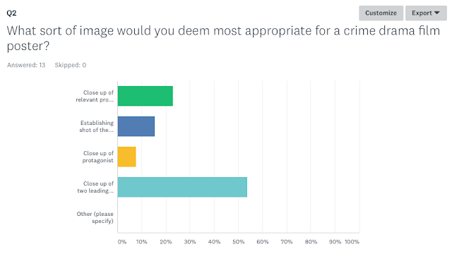
Next I asked my audience what sort of image they would deem most appropriate as it's important to choose an image that will attract my target audience. A close up of two leading characters got the most votes, so I'm going to include my victim and serial killer- the most important characters.
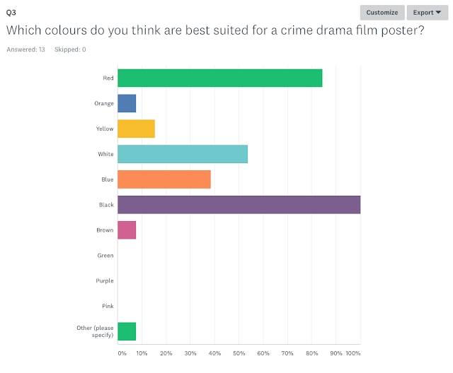

I then asked for their colour palette ideas and black, closely followed by red got the most votes. This is unsurprising as crime comes with dark connotations- hence the choice of black, and red can represent blood. However I want to create a brand and therefore am planning on sticking with a dark blue theme as my morgue scenes were filmed using a blue filter, and it's the most visually appealing and important scene. In this sense I am breaking some conventions and going against target audience views but I feel it is appropriate and in the long run will make for a more effective product.

Again the results I received were unsurprising as on most crime drama posters you will see the detective(s). This is because a majority of things that are crime dramas are TV shows rather than films, and these will more commonly follow detectives and have each episode follow a different crime. In films, however, there's less time and they have more creative freedom to instead choose the criminal to focus the storyline on, and therefore they will be the star of the poster instead. In our film our criminal/pathologist is the biggest character and the detective only plays a minor role, meaning it wouldn't actually make much sense for him to the focus of the poster.
Sunday, 28 January 2018
ANCILLARY - Poster Codes & Conventions
Film posters are a very effective piece of promotional material for films and therefore it is essential for them to clearly connote the genre of the film and attract the correct target audience.
When analysing numerous crime drama posters, there are most definitely a few running themes.
The image typically focuses on one character, the main protagonist, although sometimes it may focus on a pair or small group. Close ups are more commonly used as the actor's facial expression, very gloomy and serious, creates the perfect mood for the poster. It can vary between being an image of the hero (detective, police officer) or the villain (the criminal). This all depends on who enters the narrative. With crime TV shows it will nearly always be the detective and you watch them solve multiple crimes and deal with multiple criminals, but with films this does not necessarily always happen to be the case. The mise-en-scene will remain realistic, so as to fully draw the audience into the drama by making it relatable to the real world. As it's a crime it's relatively easy to anticipate what props will be used; guns, knives and any other weaponry/police equipment. Most crime drama posters will also have their primary setting blurred in the background, which is usually a city skyline.
The lighting used for crime drama posters is consistently dark so as to also help create the right mood for the poster and connote the metaphorical darkness of the film narrative. Too bright lighting could lead to audiences believing it's a happy and joyful film.
All film posters need a large and easy to read title so that audiences can recognise the film upon a quick glance. They tend to use the same font as the film for the title and in terms of crime dramas this is bold and harsh looking- the font name helvetica came up in my research. Most of the titles are at the bottom of the poster, just above the credits, meaning that the image will be the first thing to catch the audience's eye.
The colour palette used consists of darker colours, most commonly blue and red. This is because this is the colour of a police siren, therefore having a very close link to the crime drama genre. It would be very surprising to come across bright and happy colours such as orange and yellow, as they would create an entire different atmosphere for the poster.
As mine is also a short film I also analysed some short film posters as they differ slightly to those from mainstream feature length cinema. The main difference is the simplicity of their design as they tend to have a more niche target audience. They also don't tend to have the star vehicle as a close up for the main image as it's uncommon for them to have big names starring in their films, therefore meaning they can't necessarily be used as a selling point for the film.
Saturday, 27 January 2018
ANCILLARY- Poster Analysis 2
COPAIN (2015)
 Big blockbuster film posters will differ from short film posters. As my product will be a short film, I felt it essential to analyse a short film poster and also see how it compares to those from Hollywood.
 Copain is a French drama short film, following the story of a teenager stuck between his conservative, wealthy family and his lower class friends, but until he falls in love he is able to keep these worlds separated.
The poster in general has a very simplistic theme, which is common for a short or independent film poster. This is typically due to the fact that with big Hollywood move posters, their primary selling point(s) is their star vehicle(s) and the focus of the poster will tend to be on that particular actor/actress. Other selling points may include certain crew members (the director, producer etc) or potentially the franchise (e.g. Star Wars, The Avengers). With short and independent films, both of which have significantly lower budgets than that of a Hollywood film, this is not the case. A simplistic theme is to be expected of their posters. Short films will also have a shorter narrative (obviously) which tends to equate to having a simpler narrative, making a simpler looking poster more appropriate. With posters such as the newest Avengers film's, Infinity War, they have a significant amount of characters meaning it's a much busier poster. Short films have a tendency to focus on the narrative of one character meaning they can properly develop on their personality and background. This means their posters usually just include one character.
I love the colour palette in particular on this poster as only a small sample of colours are actually used and it's so basic, yet so effective. It makes it look visually appealing and the blue connotes almost a calm tone, complementing the idea of water very nicely. The use of darkness for the character almost contradicts this idea as it is common knowledge that dark colours connote a sort of potential evil. The darkness at the top is especially powerful as it creates the sense of darkness and danger surrounding this character, clashing with the calmness associated with the lighter colours. This juxtaposition really sets a mysterious mood and will leave the audience wondering why this character is in danger. By having the plot in mind I can appreciate the cleverness of having the character dark in a light area, next to an area dark like him. I feel this connotes the character being part of his wealthy family (represented by the light), but his darkness links him to the darkness at the top of the poster, which I feel represents his lower class friends and lover. The darkness of the character also highlights his isolation within his family and his struggle to keep his worlds separate. I personally think that with Hollywood posters they can just get away with showing off their actors, but with short film posters so much more thought goes into every single detail of it. This also follows Barthes binary opposition theory. He realised that words merely act as symbols for society’s ideas and that the meaning of words, therefore, was a relationship rather than a fixed thing: a relationship between opposing ideas. In this poster the relationship between light and dark, and in the film rich and poor, is so important. Barthes also recognised that one side will be more valued than the other, and in this case it's rich.
Friday, 26 January 2018
ANCILLARY- Poster Analysis 1
As my film is a crime drama short film, I felt it necessary to analyse a short film poster and a crime drama poster to ensure I included conventions from both, making my final piece look as professional as possible. The role of a film poster is to promote the film by connoting the genre and including things likely to attract the target audience. It's important both of these things are done effectively.
This is a more mainstream crime drama poster for a film called Public Enemies. It's set during the Great Depression in America and it follows the storyline of notorious bank robber John Dillinger as he's being pursued by an FBI agent.
The colour palette used is very simple- black and white. This creates a very serious tone for the poster, immediately connoting a serious genre for the film. The whole poster follows this theme for the sake of continuity and professionalism, helping create a brand. in breaks conventions in terms of now blue and red colours, which are used in most crime drama posters as they're the colour of a police siren and therefore have a very close link to the genre. The only bit of colour is on his face, drawing attention to the actor/character. This highlights his relevance to the plot whilst also showing off their large star vehicle.
The main image is of the main character, in this case the villain, which is primarily used for films with large star vehicles (in this case Johnny Depp). This is because their choice of actors can be used as a selling point in their marketing. The facial expression, use of a gun and general look of the male follows Gauntlett's 2002 theory that males in the media still follow traditional stereotypes as they are shown as, "Alpha males who control the action with violence." However this is also following conventions of crime drama posters. Images from a crime drama poster do typically focus on one character, and use a close up, enabling audiences to clearly see the character's facial expression and details from a distance. Not only is this to show off the actor starring in the film, but the facial expression can play a big role in connoting the tone of the film. In this poster the character is looking serious, therefore suggesting its a serious film. This is further emphasised by the shadowing on his face, making his facial features more prominent yet also making him look more dour and stern. This darkness on his face and the darkness of the colour palette both also follow crime drama conventions as bright lighting could lead audiences to mistakenly believe the film is happy and light-hearted. The choice of the villain to be the character on the poster rather than the hero is rather interesting when comparing it to other posters, but with crime dramas it's appropriate to see a variation of heroes and villains being the centre of a film narrative. I personally think that a narrative revolving around the villain is more interesting as a vast majority of films from all genres focus on the hero.
The mise-en-scene is also very effective in connoting the genre for all film posters, making it very important to get right, even if its not the primary focus of the poster. A genre convention of crime dramas is that they're set in busy cities due to the fact crime is more common in areas like that, and so a city skyline or large buildings can commonly be seen in crime drama posters, such as this one. It also straight away informs the audience of the film setting, helping them visualise it when deciding whether or not it's worth watching. Busy cities are also used to attract a wider audience, as being set in the countryside for example will relate to a more niche audience and potentially attract less people as representation is important. The gun prop is another convention, as violence is (obviously) a large part of the crime genre. Any weaponry would be relevant to the genre but as this is an American film, guns are the most common to find on a film poster. The mise-en-scene needs to remain realistic, which it does in this poster too, as part of being a drama means it has to be relatable for the audience to the real world, fully drawing them in.
The title is large and easy to read, as is the case with all film posters, so that audiences can recognise the film upon a quick glance (remembering some posters are displayed on moving vehicles, so this is vital). The same font is used that was used in the film, DVD cases etc so as to again, create a brand. It follows the same general theme of all film posters, with the title on the bottom just above the credits, making sure the image is the first thing to catch an audience member's eye. This is done because the image is the most effective part of the poster for attracting an audience.
Thursday, 25 January 2018
Rough Cut 2
With this draft we only decided to make a few small alterations:
- Luke's dialogue in one shot of scene 1 is overpowered by the music and cannot be heard
- The wind can still be heard in scene 3
- Change the credits as it does not suit the genre
- Spelling error with Luke's name
Rough Cut 1
The main thing that needs to be sorted is the length of the film as it's too long. Watching it back we also decided we wanted to change the order of some of the flashbacks.
Film Shoot Reflection - SCENE 2
 |
| Sam setting up the tent |
 |
| Sam placing the keys, coins and phone |
Scene 2 was our last scene to film- the crime scene. Although it is supposed to take place in the same location as scene 3, the train station, we instead made the decision to film at college in the car park. It was incredibly more convenient than travelling all the way to the train station, plus ensured we would be allowed to set up a tent. It also helped minimise public interference as we chose a quiet area of the car park, plus most pupils and students were in lesson over the duration of our filming. Originally we had planned to use our college's drama studio but unfortunately it was booked up. This change of location again meant that some alterations had to be done to our shot list.
Sam and I arrived to college extremely early and began setting up straight away. The night before we had set up traffic cones in our desired area to stop other people from parking there. We started by setting up the tent that we had collected from the member of staff involved with the Duke of Edinburgh Award. Myself, Sam and our teacher struggled against the wind and the rain to set up the tent before transporting the equipment and other props over. One of us had to remain with the tent at all times to ensure it didn't blow away in the wind- we had a few near misses. We then built our crime scene, carefully placing the scattered keys, coins and phone using a printed photo we had taken the week before, making sure they were put in the same place for the sake of continuity. We also covered our scene in police tape. We then dressed our actors in their police and crime scene photographer outfits.
Sam and I arrived to college extremely early and began setting up straight away. The night before we had set up traffic cones in our desired area to stop other people from parking there. We started by setting up the tent that we had collected from the member of staff involved with the Duke of Edinburgh Award. Myself, Sam and our teacher struggled against the wind and the rain to set up the tent before transporting the equipment and other props over. One of us had to remain with the tent at all times to ensure it didn't blow away in the wind- we had a few near misses. We then built our crime scene, carefully placing the scattered keys, coins and phone using a printed photo we had taken the week before, making sure they were put in the same place for the sake of continuity. We also covered our scene in police tape. We then dressed our actors in their police and crime scene photographer outfits.
 |
| Crime scene photographer (helping hold the tent) |
 |
| Police officer |
An hour and a half after initially arriving our two main actors arrived. They arrived in our requested outfits for them meaning that as soon as they arrived we were pretty much ready to get straight into filming. Our actress was busy with an A Level Drama performance and the body double we used in the morgue scene was unfortunately also unavailable which we were informed of very last minute. Instead, we again had to improvise and Sam dressed in the coat our actress wore in the murder scene, and covered himself with the sheet.
 |
| Me filming with a blue filter |
This scene involved one tracking shot for which we decided to use the steadicam rather than the dolly. This is because I wanted the tracking shot to feel like a point of view shot following the detective and make the audience feel as if they were actually a part of the crime scene- very immersive. For all of the other shots we kept it on a tripod, keeping the shots steady. As Sam was under the sheet for most of the shoot I found it a struggle to quickly adjust the tripod legs according to the desired shot, so occasionally additional help was required from our extras.
One major issue we had was the weather. The rain was very on and off, with strong winds battering against the sides of the tent very persistently. As the tent was not pegged into the ground due to it not being grass, any extras who were not visible in a specific shot had the task of holding our tent down. It was also another extremely cold day meaning I was shaking for the entire scene, despite layering up. This was a problem I could not really overcome, but had to tolerate instead.
I filmed the entire scene similarly to the morgue scene- doing a minimum of two takes for each shot, one normal and one with a blue filter. Despite the effort this required we ended up deciding that we preferred the normal shots.
Overall Sam and I were happy with how it went. The weather was against us and made things incredibly difficult, but we persisted and the end resulting footage looked good.
Film Shoot Reflection - SCENE 3
Our original plan for scene 3 was to film at a nearby multi-storey car park, but unfortunately on the day we had an issue with snow. Instead we decided on shooting at our local train station, as it was nearby yet also a suitable and effective location for our genre. It had lots of space and a good atmosphere. No behind the scenes photos were taken as we remained too focussed on shooting as quickly as possible due to the low temperatures and gradual loss of light, which would effect continuity in our final product. This is also why arriving fully prepared was absolutely essential for this scene. As the location had changed, slight alterations were made to our shot list.
We met our actor there and transported ourselves along with our equipment and actress after college. We parked ourselves at the far end of the car park in an attempt to minimise public interference. We arrived fully prepared with two cameras, a Canon 5D and a 6D, a few batteries and a few memory cards. We also brought the dolly, tripod and steadicam. Upon arrival we quickly discovered that the dolly came in extremely useful as not only did it enable us to perform the smoothest tracking shots possible, it also provided a good height for our tripod. We swapped to the steadicam when filming the tracking shot up the stairs, as a dolly would not work efficiently for this. For each shot we did multiple takes, even if I felt fairly comfortable it was a good one just to ensure that whilst editing we would have the best footage. With the placement of the coins, phone and keys when our actress drops them, we took photos to make sure that when filming scene 2, the crime scene, the placement would remain the same.
One issue we found was the brightness of the daylight. A convention of crime dramas is their low lighting used to set the right mood and atmosphere, and specifically as this was the actual crime happening it was essential the scene not be too bright. We kept the aperture as low as possible, but agreed to edit it in post production as it was a problem we could not avoid.
Another issue was the background noise. Whilst filming in public places similar problems will always arise in terms of cars, people, and in our case also trains moving in the background. They hold the biggest threat to continuity. To avoid this we didn't film whilst cars, people or trains went past, and we kept our filming to as small an area as possible to limit any changes occurring. In most shots all you can see is our actor's car.
Overall, considering Sam and I had to last minute change the location we were very pleased with the results when looking back on the footage. We effectively dealt with the issue of the public, and are confident that editing in post will solve our brightness issue.
Film Shoot Reflection - SCENES 1&4
 |
| The original look of our location |
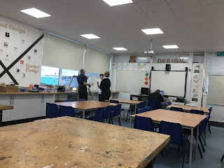
Scenes 1 and 4 were filmed in our college's design technology classroom. Sam and I arrived early to begin setting up. First this began with us transferring all of the props into the room, most difficult being the screen and hospital bed from the college's sick bay. Starting early ensured we had plenty of time to move things around and set up our scene exactly as envisioned. There was a lot of moving around to do as we needed to completely clear that corner so as to make our scene look as realistically as a morgue as possible.
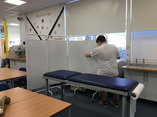 |
| Sam setting up the screen |
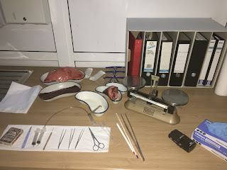 |
| The set up of the doctor's tools |
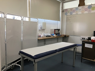 |
| The final look of the morgue |
 |
| Experimenting with the lighting |
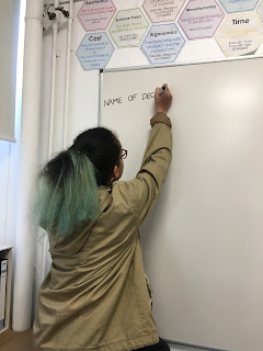 |
| Me writing details of the victim on the board |
After setting up all of the props, Sam and I brought in all of our filming equipment. This included two cameras to capture more footage, and two tripods to ensure stable shots. Both were set up in preparation for the shoot. Once this was all done we practised with the cameras, lighting and filters. This extra preparation time prevented us from wasting the time we got with our actors later on in the day. We discovered that we really liked the level of brightness created by our 3 point lighting kit with a bit of natural light that escaped in through the blinds as it created the perfect dark and mysterious atmosphere we were hoping for. The blinds helped us control the amount of light that could escape into our scene, as did the aperture on our camera lenses. This practise time was also spent experimenting with filters. Morgue scenes are associated with dark and gloomy colours, so we used green and blue filters separately and together on the lights and the lenses. We eventually decided to film all of our shots normally and then again with a blue filter held over the camera lens, as it set the perfect mood. The colour blue connotes coldness and sadness and mystery. Morgues are notably cold and depressing places, and we wanted our doctor to come across as a creepy and mysterious character. However we wanted the option between plain and a blue filter, so shot with both.
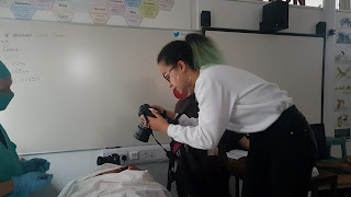 |
| Me filming a high angle shot of the body incision |
Halfway during the day we finally brought one of our actors in, Mr Howe. Our actress was unavailable until a couple of hours later so Sam and I made the decision to use a stand in, a friend of ours of similar size to our actress. This meant that during these hours we only filmed the shots that would not require seeing the actress' actual face, as waiting for the actress would have meant rushing some of our shots or possibly even having to miss some out. We also made sure to get all of the organ scenes out of the way as we knew they would take up the most time, but had the most potential to create some brilliant shots. Scene 1 took up the whole day, unfortunately leaving us with limited time at the end for scene. This lead us to make the decision to cut scene 4 down to one pan shot. For this we had luckily brought the dolly, just in case any decisions like this were made last minute. This shot did take a significant amount of attempts as we wanted the timing and the look of the shot to be perfect. Our actor had to leave early, and more the remaining half an hour whilst we still had our actress we filmed the close ups of her face and took any necessary photos for our double page spread and poster.
Overall Sam and I believe the film shoot went extremely well. We were very happy with the shots we got, despite being stuck for time at the end. We decided to act some extra shots as we absolutely loved the general look of the scene.
Costume Sketches/Ideas
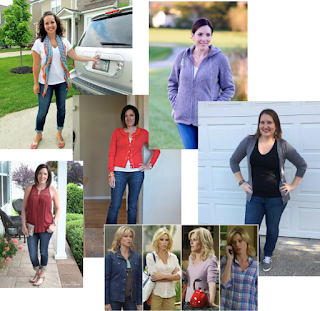 For our main character, we wanted her to very visibly come across to our audience as a motherly character. I researched typical mum-like outfits (as shown right) and Sam and I decided on warm colours such as purple, grey, pink, cream etc. Plain denim jeans appeared to be a running theme, along with comfortable jackets or more commonly cardigans. Sam and I made this decision using very basic mum stereotypes. We looked at what our mums and friend's mums dressed like, and looked at mother characters in other films/TV shows. This way we ensure that we represent the right type of audience with this character, making her more relatable.
For the morgue scenes we just need our actress to wear a plain vest and shorts, as in a morgue the dead person will be stripped so as to make incisions and inspections of the body easier. Her body will be completely covered with a cloth anyway and thin clothes will prevent there from being any lumps and bumps underneath the cover.
With our serial killer/pathologist, when he is working in the morgue we have bought a doctors gown and gloves for him to wear. This is because this is what a pathologist will wear in a morgue so as to keep the environment sterile, not tamper with evidence and keep their normal clothes clean. In terms of his actual outfit, we intend for him to be smartly dressed. Intelligent serial killers are associated as dressing smartly, so in shirts and trousers. We also decided on our actor to wear a long black coat, for an almost Sherlock type vibe. This connotes that he has a darkness and mystery about him.
 |
The other characters starring in our film play the roles of police officers and crime scene photographers. The police officer will be dressed in a high vis jacket, bullet proof jacket, plain trousers and plain shoes. He'll also be equipped with a walkie talkie and a police hat.
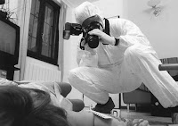 The crime scene photographers will be wearing ___ and will be walking around with other cameras from our college's media department. We chose these outfits after researching what would be typically worn on a crime scene as not only do we want them to be very stereotypical so as to be easily recognised, but we want our film to be as accurate as possible.
Make Up/Special Effects
Two scenes in our film require a character to appear dead. For this we went on a trip to super drug to buy:
- Black, blue, purple eyeshadow
- Pale foundation
- Black, purple lipstick
The eyeshadow will be used to darken the eyes, and the lipstick will be used to darken the lips. We are going to buy the palest foundation possible to ensure the skin looks pale, as if she has been dead for a couple of hours.
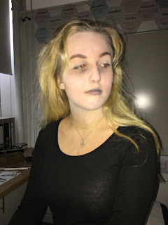 |
| The actress' final look |
We are also using a fake autopsy vest bought on Amazon to create a very realistic looking morgue scene. To make this appear even more realistic we are using fake blood and putty for the incision.
Crew & Equipment List
Crew
- Katie Price - Director, Cinematographer, Producer https://www.imdb.com/name/nm8946401/?ref_=ttfc_fc_cr2
- Sam Scott - Editor, Sound Designer, Production Designer
Equipment
- Steadicam
- Tripod
- Canon 5D
- Canon 6D
- Camera batteries
- Memory cards
- 3 point lighting kit
- Blue gels
- Dolly
Cast List
- Rory Wilton - DETECTIVE - he is the biggest star we cast in terms
of previous acting work as he is an actor from Poldark who has also done lots of other film and TV work over the last 20 years, is actually a minor character, the detective. We were really lucky to be able to secure Rory Wilton for this role as it is often really busy. He breaks conventions of a stereotypically Hollywood hero as he is in his late 40s and doesn’t fit the stereotype of most heroes; fit, muscular, young (20s) etc. We felt this made him more relatable and represented our audience more while bringing something fresh and new to British cinema. Also, this better fits the conventions of crime dramas as male detectives are shown to fit Butch’s 1998 theory of males being, ‘Well intentioned but dump and flawed’ as, despite being likebale, he is unable to solve the murder. He represents middle aged males and females in the audience and follows character conventions of characters like; Cracker, Frost and Wycliffe who are all intelligent, middle aged yet flawed in some way. - Bella Jeffries - WOMAN - fits conventions as she is stereotypically young and attractive which follows Laura Mulvey’s 1975 gender theory as she is an object of desire for the killer and males in the audience. She was chosen as we filmed one of her drama performances and decided we really liked how she acted in front of the camera.
- Luke Howe - PATHOLOGIST - an experienced white middle aged actor who looks physically strong and unstable enough to be a killer but also professional enough to be taken seriously as a pathologist. He fits Gauntlett’s 2002 alpha male theory because he is an alpha male who controls the morgue and action with violence.
- Richard Mann - CORONER - in his early 60s who has previous experience acting in another popular Cornish TV Drama Doc Martin. Richard follows conventions of coroners and doctors as they are often cast as older experiences males at the end of their career. He also fits some crime drama conventions as older people are often part of the target audience and show like New Tricks and Frost use older actors to represents older males in the audience, which is what Richard does in ours. He breaks the conventions of age because he does not appear helpless in the scene.
- Jessica Jenkins - BODY DOUBLE FOR WOMAN - chosen simply as she's a close friend of ours available on the day who's not only willing to lay under a blanket for a long time, but also has a similar body type as our actress.

EXTRAS
- Joe Jackson - CRIME SCENE PHOTOGRAPHER
- Bartek Smolis - POLICE OFFICER
- Rebecca Stott - CRIME SCENE PHOTOGRAPHER
Subscribe to:
Comments (Atom)


